
Incorporating Patterns and Prints: Tips to Boost Visual Interest

In the world of design, patterns and prints play a pivotal role in adding depth and character to any space. They’re not just decorative elements; they’re tools that can transform a bland room into a vibrant sanctuary. Whether it’s a bold geometric pattern or a subtle floral print, incorporating these designs can elevate the aesthetic appeal of your home or wardrobe.
Note: This post may contain affiliate links, which means if you buy from my link I might make a small commission. This does not affect the price you pay. See the full affiliate disclosure here.
However, mastering the art of mixing and matching patterns isn’t always straightforward. It requires a keen eye for detail and a dash of creativity. From understanding color theory to balancing scale and proportion, there’s an art to making patterns work in harmony. In the following sections, we’ll dive into the essentials of using patterns and prints effectively, ensuring your spaces and outfits stand out with sophistication and style.
Understanding Patterns vs. Prints
When delving into the realm of decor and fashion, distinguishing between patterns and prints becomes crucial. Though often used interchangeably in casual conversation, they hold distinct meanings that can influence the design process and outcome.
Patterns refer to the repetition of a specific design, where the design element repeats in a predictable manner. This repetition could be geometric shapes, abstract figures, or organic motifs. Patterns are about creating rhythm and consistency in a space or garment, enhancing its visual appeal through structure. They’re commonly seen in home wallpaper designs, fabric textures, and even architectural elements.
Prints, on the other hand, involve applying a design or motif onto the surface of a material, such as fabric or paper, through various techniques like digital printing, screen printing, or engraving. The design in prints doesn’t necessarily repeat in a structured or predictable manner. From floral designs on curtains to intricate designs on clothing, prints add depth and interest through their detailed artwork.
To master the art of using patterns and prints, one must understand their characteristics:
- Scale and Proportion: Both elements should complement the size of the room or body to avoid overwhelming the viewer.
- Color Theory: Utilizing a harmonious color palette ensures the elements blend seamlessly within the space or outfit.
- Balance: Mixing patterns and prints can add dynamism, but it requires a careful balance to maintain a cohesive look.
For more in-depth information on the differences and how to effectively use patterns and prints, refer to reputable sources like Architectural Digest for home design or Vogue for fashion advice. These platforms offer expert insights into incorporating these elements into various designs creatively and thoughtfully.
Exploring Different Types of Patterns

In the vast world of design, patterns vary widely, each bringing a unique flavor and atmosphere to spaces and garments. Recognizing the distinct types of patterns helps in selecting the perfect match for any project, ensuring that the intended message or style is effectively communicated.
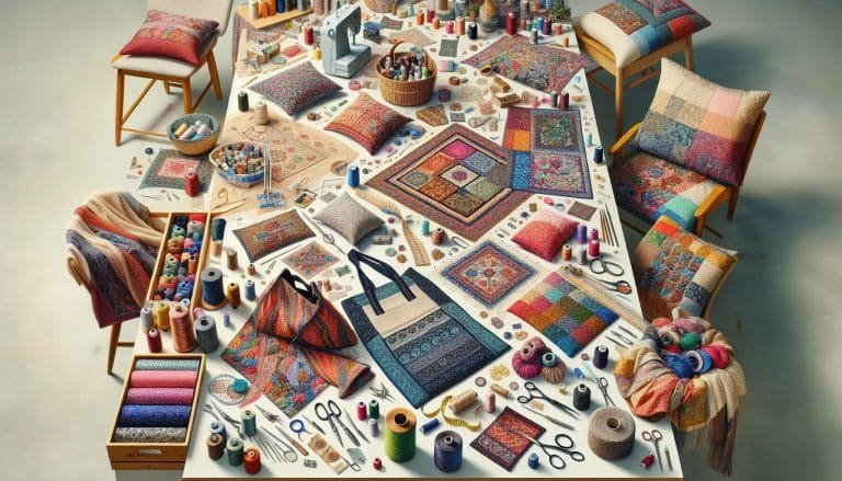
Geometric Patterns stand out due to their structured form and are known for their ability to add a strong, modern vibe to any space or ensemble. They consist of repeating geometric shapes like triangles, circles, and squares, offering a clean and orderly look. For inspiration on how to employ geometric patterns in your designs, renowned publications such as Architectural Digest provide numerous examples and decor ideas.
Floral Patterns, on the other hand, bring a touch of nature and a sense of softness to designs. These patterns are characterized by the representation of flowers, which can range from detailed and realistic to abstract interpretations. Floral patterns have been a staple in both interior design and fashion for centuries, as noted in various features by Vogue.
Abstract Patterns are designs that don’t necessarily represent specific physical objects but are instead based on the idea of expression through shapes and colors. These patterns can be incredibly versatile, adding a unique and intriguing element to any piece. They are often used when a designer wishes to make a bold statement or evoke a certain feeling without relying on recognizable imagery.
Animal Prints mimic the patterns found on animal fur or skin, such as leopard spots or zebra stripes. They have become increasingly popular in fashion and home decor, symbolizing luxury, power, and exoticness. Despite their wild origins, when used thoughtfully, animal prints can add sophistication and depth to any look or space.
Each pattern type offers a different energy and effect, making the choice of pattern an essential consideration in design projects. Whether aiming for elegance, boldness, or minimalism, there’s a pattern type that fits every vision. For those looking to dive deeper, sources like Elle Decor provide extensive galleries and guides on incorporating various patterns into home interiors.
Choosing the Right Color Scheme

When venturing into the realm of patterns and prints, selecting the right color scheme can transform a space from bland to visually stunning. The color palette is central to design, influencing mood, creating cohesiveness, and complementing the chosen patterns.
Firstly, understanding color theory is crucial. Colors can be categorized into primary, secondary, and tertiary groups. Each category plays a unique role in design, and knowing how to mix these colors can lead to a harmonious color scheme. Websites like Color Matters offer a deep dive into color theory, providing a good foundation for those new to design.
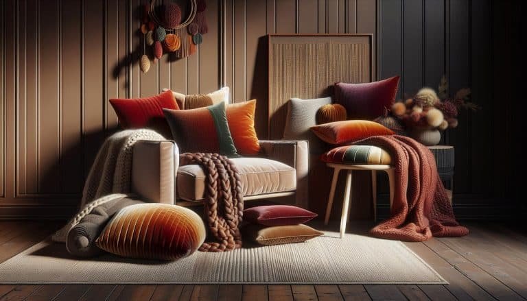
Incorporating Neutral Tones with vibrant patterns is a tried and tested method. Neutrals such as beige, gray, and white offer a backdrop that allows the patterns to be the focal point. This doesn’t mean the space has to be lacking in color but rather uses a balance to enhance the overall aesthetic. For inspiration, Architectural Digest showcases examples where neutral palettes beautifully complement bold prints.
Color trends also play a significant role. Each year, color experts at the Pantone Color Institute select a “Color of the Year,” which significantly influences design trends. Keeping abreast of these trends can inspire and provide a contemporary edge to your design projects. Pantone’s website (Pantone) is an excellent resource for exploring the current Color of the Year and understanding how it can integrate into various design schemes.
Finally, it’s about personal preference and the story you wish to tell through your design. Whether opting for a Monochromatic look, a Bold and Bright palette, or a Soft and Subtle combination, the colors chosen should resonate with the space’s intended mood. Sites like Elle Decor offer countless examples of successful color schemes in interior design, proving that with the right colors, any pattern can shine.
Mixing and Matching Patterns Like a Pro

Successfully mixing and matching patterns in design projects isn’t just about throwing together various prints and hoping they stick. It’s an art form that, when done correctly, can add depth, interest, and personality to any space.
Scale and balance are key when combining different patterns. Designers recommend starting with a large-scale pattern as the primary focus and then incorporating smaller-scale prints to complement it. This approach prevents the designs from competing for attention and ensures a cohesive look. For example, a bold, large floral wallpaper can be paired with smaller geometric-patterned pillows or an intricate rug.
Color plays a significant role in mixing patterns. Sticking to a consistent color palette across different patterns can tie the look together, making the overall design feel intentional and harmonious. This doesn’t mean all patterns must be in the exact same hue, but they should share a common color that serves as a thread connecting the various elements. For inspiration, sites like Elle Decor and Architectural Digest offer an array of examples where color has been used effectively to unify mixed patterns.
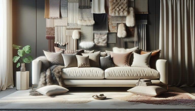
Texture is another aspect to consider. Adding a variety of textures among the chosen patterns can add depth and interest to the visual appeal. A mix of materials, such as silk, velvet, or wool, each with its own pattern, can enhance the tactile experience of a space while keeping the visual aspect engaging.
Finally, it’s important to let personal style guide the process. Mixing and matching patterns should reflect the individuals’ tastes and the mood they wish to create in their space. Whether looking for a vibrant and eclectic look or something more subdued and sophisticated, the key is in the balance and harmony of the elements involved. For those uncertain where to start, industry experts frequently share their insights on platforms like AD Pro providing valuable tips for both novices and seasoned designers alike.
Incorporating Patterns in Your Space and Wardrobe
Incorporating patterns into both living spaces and personal attire isn’t just about following trends; it’s a way to express individuality and create visually engaging environments and outfits. When it comes to home interiors, a thoughtfully selected pattern can transform a room from mundane to magnificent. Similarly, in fashion, patterns bring outfits to life, adding depth and character.
When integrating patterns into home decor, consideration of scale and balance is crucial. Larger patterns work well on focal points such as wall art or a statement piece of furniture, while smaller patterns can add interest without overwhelming in accessories like cushions or rugs. Architectural Digest (AD) recommends starting with a color scheme to ensure that the patterns in a room complement rather than clash with each other.
In wardrobe styling, the integration of prints and patterns opens a plethora of possibilities for personal expression. Vogue (Vogue) suggests mixing patterns with similar color palettes to maintain a cohesive look. Layering a striped blazer over a floral dress, for instance, can add sophistication and depth to an ensemble. Additionally, incorporating textured fabrics such as silk or linen can introduce a tactile dimension to patterned outfits, making them stand out.
- Tips for Incorporating Patterns:
- Start with a dominant pattern and build around it.
- Maintain a consistent color palette across patterns for cohesion.
- Mix different scales of patterns to add visual interest.
- Consider the texture of materials for a richer, layered look.
Designers and stylists alike emphasize the importance of personal style in the decision-making process. Whether aiming for a vibrant, eclectic look or a more subdued, elegant aesthetic, the key is in the details. Experimenting with different patterns and textures, whether in home décor or personal wardrobe, can lead to surprisingly delightful results. Both AD Pro and Vogue offer extensive guides and inspirations for those looking to explore the art of mixing patterns, providing valuable insights for beginners and experienced designers alike.
Conclusion
Exploring the dynamic world of patterns and prints opens up endless possibilities for personal and spatial expression. Whether it’s breathing new life into a room or elevating a wardrobe, the key lies in embracing individuality while adhering to principles of scale, balance, and color coordination. With guidance from industry giants like Architectural Digest and Vogue, anyone can master the art of mixing patterns to create cohesive, visually stimulating environments and outfits. Remember, the journey into patterns is not just about following trends—it’s about making a statement that’s uniquely yours.
Frequently Asked Questions
How can patterns express individuality in home decor and fashion?
Patterns play a crucial role in expressing individuality by allowing people to showcase their personal style through the choice of designs in home decor and fashion. From bold and vibrant to subtle and elegant, patterns can create visually engaging environments and outfits that reflect personal tastes and preferences.
What is the importance of scale, balance, and color coordination when incorporating patterns?
The importance of scale, balance, and color coordination lies in their ability to create a cohesive look when mixing patterns. A balanced scale ensures that no single pattern overwhelms the others, while color coordination helps unify different patterns, making the overall aesthetic pleasing and harmonious.
What are some tips for beginners wanting to mix patterns effectively?
For beginners, start with a dominant pattern and maintain a consistent color palette across the patterns to ensure harmony. Experiment with mixing different scales of patterns and consider incorporating textures for a richer, more layered look. Always prioritize your personal style to achieve a look that feels authentic.
What advice do industry experts offer for mixing patterns in decor and attire?
Industry experts from Architectural Digest (AD) and Vogue suggest starting small with accessories or accent pieces to gain confidence before tackling larger projects. They emphasize the importance of not fearing to experiment and advise looking for inspiration in nature, art, and fashion to find interesting and harmonious pattern combinations.
Can patterns be both vibrant and elegant?
Yes, patterns can be both vibrant and elegant depending on how they are incorporated into decor or attire. Choosing the right colors, scales, and types of patterns can achieve a range of aesthetics from bold and lively to sophisticated and refined, allowing for personal expression in both vibrant and elegant ways.